HQ
1200 N Center St. Bottom Floor
Stockton, CA 95202
1200 N Center St. Bottom Floor
Stockton, CA 95202
Whether you have a project in mind, or just want to say hi.
hello(at)madebykaleidoscope.com
.png)
.png)
.png)
Coffee that celebrates connection.
The Revive brand mark was designed as a bird—symbolizing the quiet but powerful way life spreads through a community. Just as birds scatter seeds that grow into plants and flowers, bringing new life wherever they go, Revive strives to cultivate connection and renewal through something as simple as coffee. Kaleidoscope crafted the mark with clean, balanced forms to ensure clarity and versatility, allowing it to live seamlessly across packaging, signage, and brand touchpoints while expressing Revive’s mission of sparking life and connection in the communities it serves.

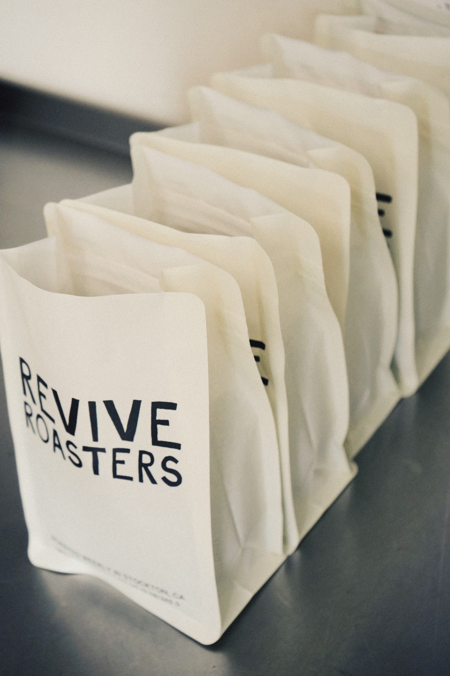
The Revive coffee packaging was designed to embody the brand’s essence—coffee that celebrates connection—while honoring a commitment to sustainability. Kaleidoscope selected biodegradable materials and paired them with a clean, minimalist design that captures the spirit of Revive: approachable, purposeful, and full of life. Every detail—from typography to color palette—was crafted to reflect the brand’s warmth and authenticity. The result is packaging that stands out on the shelf while conveying Revive’s mission: fostering connection, community, and meaningful moments over coffee.
%201.jpeg)
.jpeg)
.jpeg)
.jpeg)
%20.png)