HQ
1200 N Center St. Bottom Floor
Stockton, CA 95202
1200 N Center St. Bottom Floor
Stockton, CA 95202
Whether you have a project in mind, or just want to say hi.
hello(at)madebykaleidoscope.com
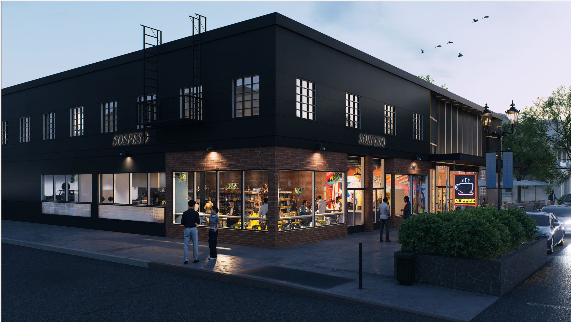
Sospeso is a place where every person is valued, honored, and belongs.
The Sospeso wordmark was designed to reflect warmth, dignity, and belonging. Crafted with soft, welcoming forms and balanced proportions, the mark carries a quiet strength that mirrors Sospeso’s mission—creating a place where every person is valued and honored. Its simplicity ensures clarity and versatility, allowing the identity to feel equally at home on coffee packaging, signage, and community touchpoints while consistently expressing the spirit of connection at the heart of Sospeso.

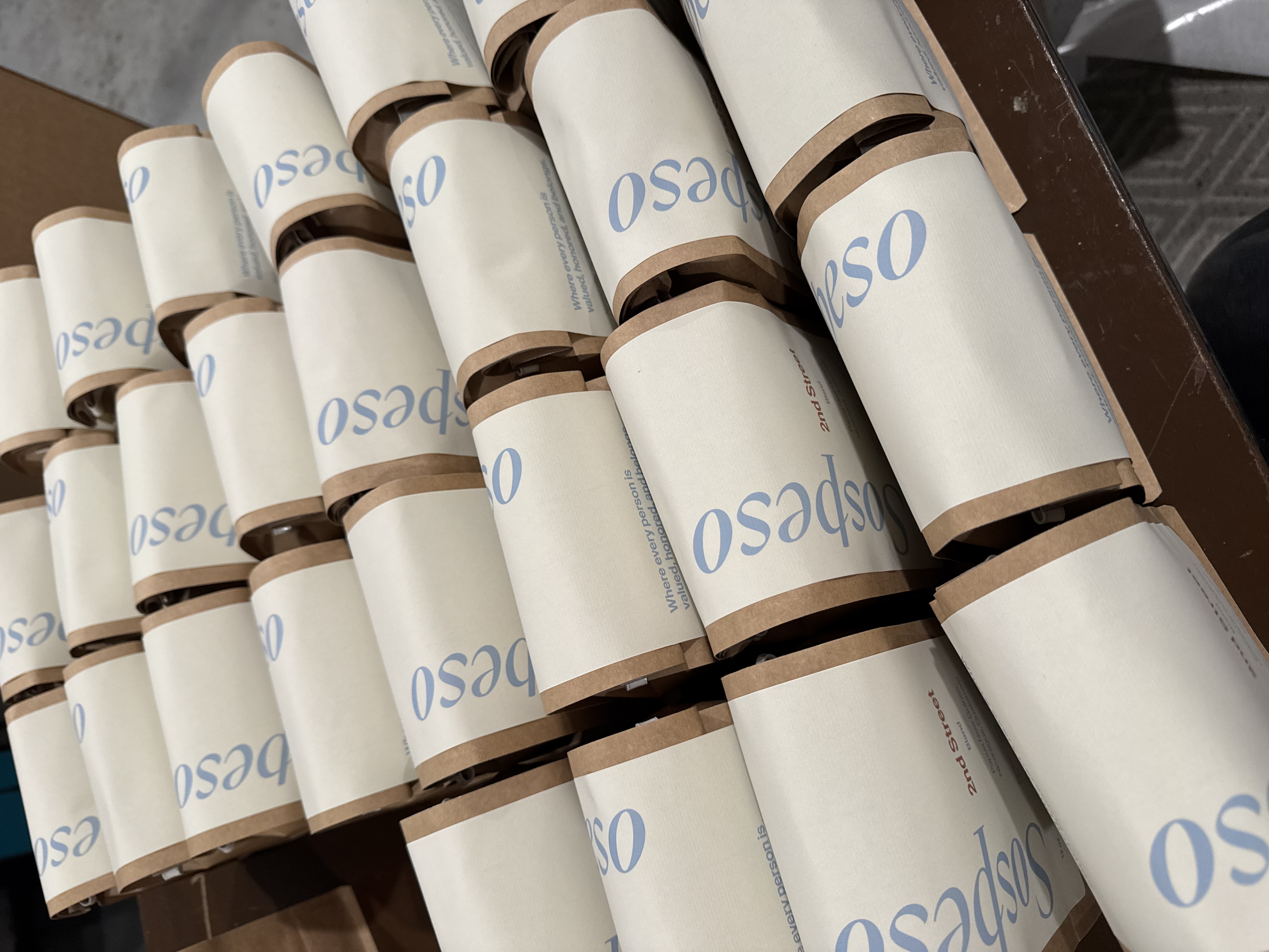
The Sospeso coffee packaging was designed to extend the brand’s spirit of warmth and belonging into every cup. Kaleidoscope created a system that feels inviting, human, and full of character—pairing approachable typography with thoughtful color and simple, expressive details. The result is packaging that not only stands out on the shelf but also reflects the heart of Sospeso’s mission: bringing people together and creating meaningful moments over coffee.
"They truly cared about capturing our vision and ensuring the design reflected who we are. Their openness, consistency, and attentiveness made the experience incredibly smooth. We would absolutely recommend Kaleidoscope to anyone in need of design or branding support. They are friendly, responsive, and genuinely invested in helping others elevate their businesses."
%20.png)